Start views
The start view is what a visitor sees on your page before they open the chat: the button or bar in the corner, and anything that unfolds from it.
Freeday sets the start view per widget, so get in touch if you want a different one. It is not something you change from your own page.
Chat button
A round button in the bottom-right corner. Clicking it opens the chat.
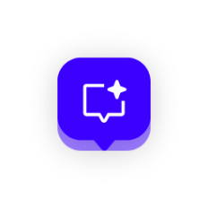
Use it when you want the chat available but unobtrusive.
Foldable chat button
Starts as the round chat button and unfolds a couple of seconds after the page loads to show a title and a subtitle — usually the digital employee's name and a short invitation. It folds back on its own after a few seconds, and unfolds again when the visitor hovers it.
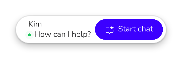
You can set the title and the subtitle.
Use it to introduce the digital employee by name without permanently taking up space.
Chat bar button
A bar the visitor can type into straight away, with up to two suggestions above it. Typing a message or picking a suggestion opens the chat and sends it immediately.
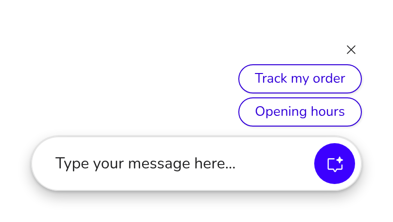
You can set the placeholder text and the suggestions. Keep suggestions to about 15–20 characters so they fit on one line.
Use it to lower the barrier to asking the first question.
Centered chat button
The chat bar, centered along the bottom of the page instead of tucked into the corner. The chat window fades in over the page rather than growing out of the corner.

You can set the same placeholder and suggestions as for the chat bar button.
Use it on pages where the digital employee is the main thing on offer, such as a support landing page.
Unfolded chat view
The chat bar button, with the chat already open when the page loads. The visitor arrives in the conversation instead of having to start one.
Use it on a page dedicated to the digital employee.
Full screen
No launcher: the chat is open from the start and fills the space you give it. The header offers a restart button instead of minimise and close, because there is no launcher to collapse back into.
Use it when you embed the widget inside another application — see the guides for SharePoint, ServiceNow and Salesforce.
Colour
Every start view uses one of two surfaces:
- White — a solid, light panel.
- Glass — translucent, for dark or busy backgrounds.
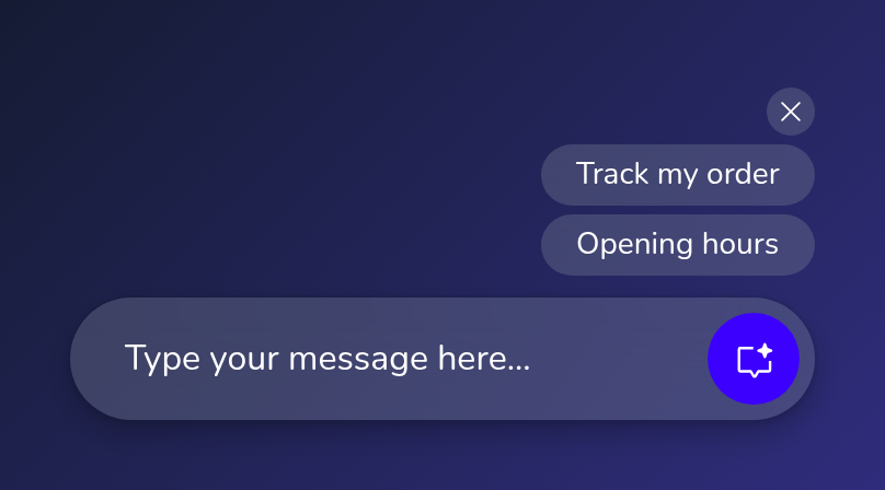
The colour covers the whole start view, so the launcher, the suggestions and the teaser always match.
Teaser
An optional card that appears in place of the start view when the page loads, with a title, a subtitle and a button. After about five seconds it makes way for the start view itself. Clicking anywhere outside it dismisses it, and it is shown once per visit.
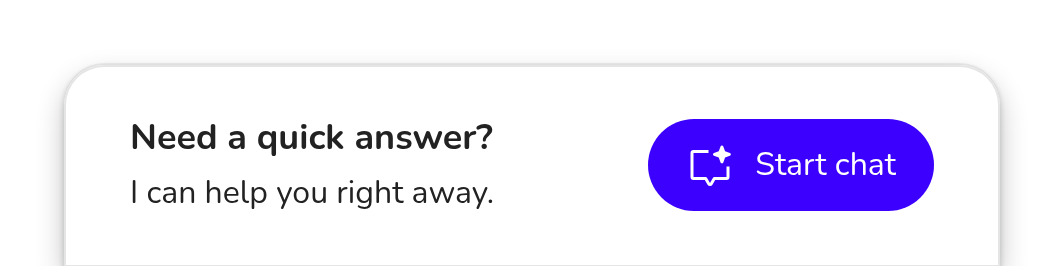
You can set the title, the subtitle and the button label.
The teaser only applies to the start views that wait for the visitor, so not to the unfolded chat view or full screen.
Start views and how the chat opens
These are two separate settings. The start view is what the visitor sees before the chat opens. How the chat then presents itself — as a window in the corner or across the full screen — is configured separately, and on desktop the visitor can switch between the two while chatting. You can also force the chat open from your own page; see Configuration & user context.